From Mood Board to Final Design (two)
With your mood board done, you have narrowed down your most favourable ideas. Remember you’ve done your research, went through all the possibilities and ideas and created a look for your space that you are happy with.
On your mood board, you probably have a selection of colours for the walls. It is time to narrow them down and make the decision which colour to choose. Exciting!!!
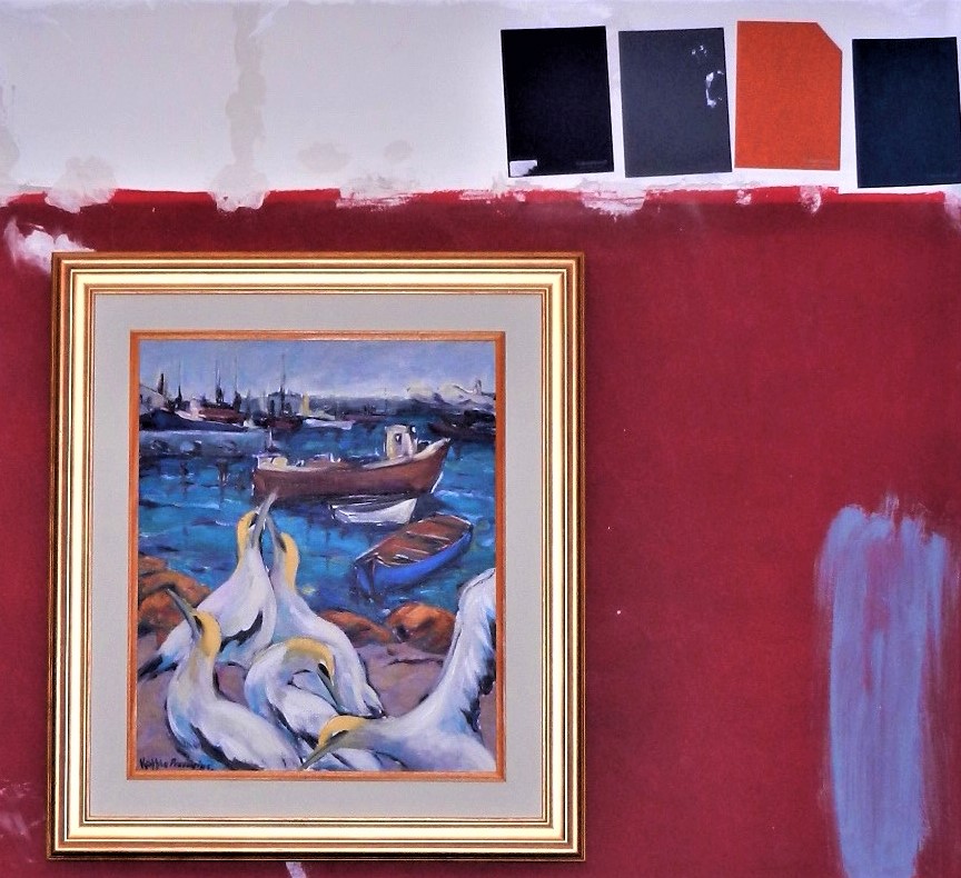
It is very important to see the colour against the wall of the room you want to change because that is the only way to actually see what it will look like. With most paints these days you can either buy colour panels or a sample pot. Put the colour panels against the wall or paint a block on the wall. Try and add some of the furniture, soft furnishings or artwork around it, just to see how it will work together.
The golden rule is that the more thorough your preparation before any painting can happen, the more professional the outcome. Sometimes it feels as if you do more preparation than anything else, but trust me it is totally worthwhile the effort.
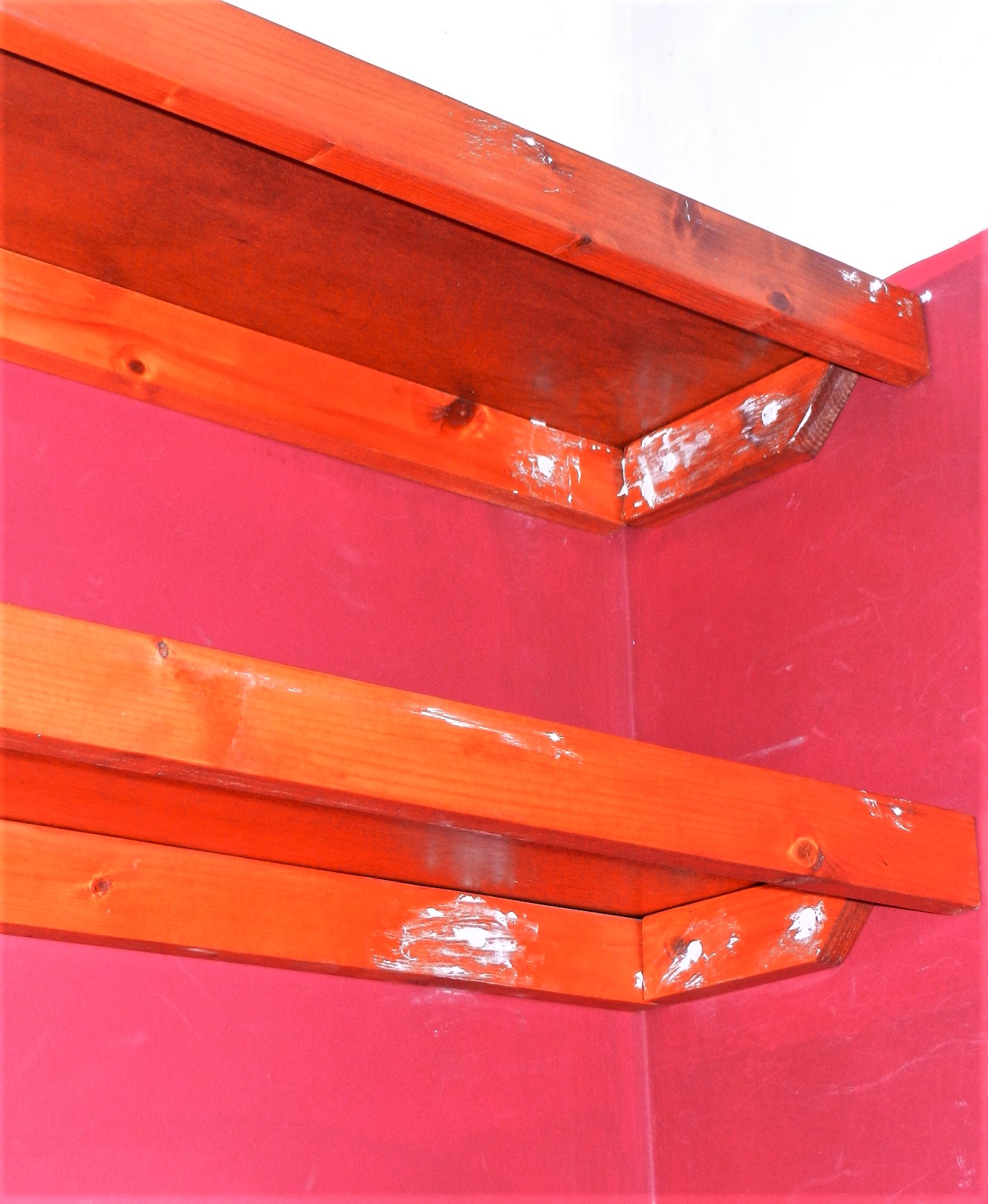
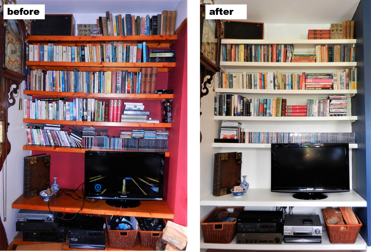
Again, I’ll refer to my own living room: I wanted the bookshelves on both sides of the fireplace painted the same colour as the walls to create a more cohesive look. That meant I had to sand them down – definitely my least favourite job – and put wood filler in all the holes to give an overall smooth finish before painting the undercoat. The end result is a beautiful streamlined look as if the shelves are part of the wall. And that was my aim with these bookshelves. Other preparation includes the filling in of any hairline cracks in the walls. I used Polycell Polyfilla for that job!
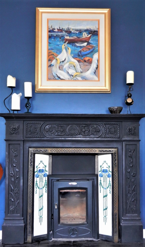
Dado and picture rails are usually associated with period properties, but I think you can be very creative with them so I decided to keep the one in this living space. It did look a bit dated, so again to make it part of the wall I decided to paint them the same colour as the wall. The part of wall above the dado rail I painted the same colour as the ceiling. This gives the illusion that the ceiling is higher than it actually is and gives a feeling of more space. The dado rail in this room is mainly used as a picture rail and to display my Delft tiles, as seen below.
When changing one space in your house it is important to remember it is part of a unity. So, to create a harmonious flow in your apartment/house make sure the colours of the different rooms work together. You don’t have to paint each room the same colour, they just need to work together!
The colour I used on the walls, the bookshelves, dado rail and skirtings is orchid white from Dulux. I used soft sheen on the walls and satinwood on the wooden parts, both water-based. And the ceiling paint is also from Dulux.
The chimney breast colour which is my focal point in the room is from Colourtrend and is called mussel. It is also soft sheen and a washable interior paint with a gentle illuminating finish. I am totally in love with this paint and also the colour because I really think it lights up, if that is possible. Also, the paint panel was exactly the colour which is now on my wall – impressive.

In my final blog on this theme I’ll show you the final design and finishing touches to pull it altogether.


Leave a Reply
Want to join the discussion?Feel free to contribute!